François Chastanet
Architect, graphic & type designer, documentary author
April — May 2023

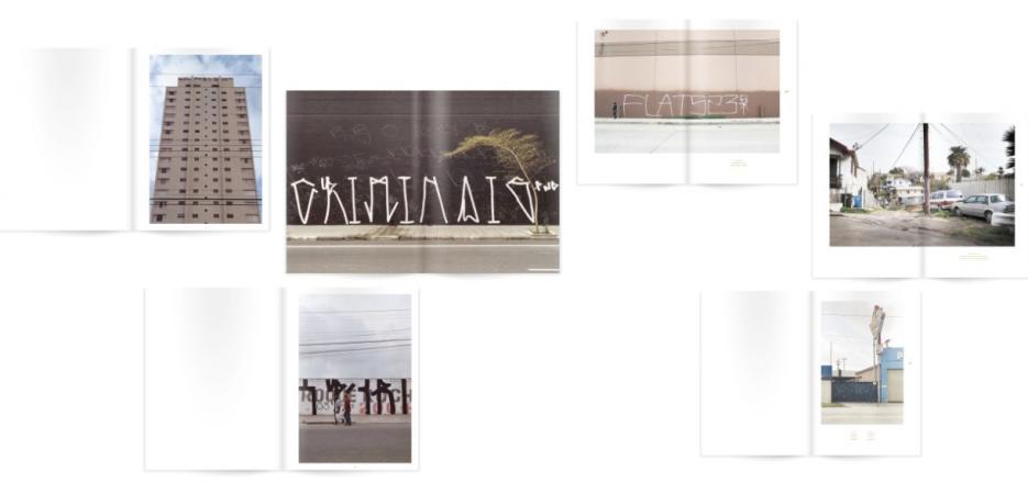
A selection of double-page spreads from “Pixação: São Paulo Signature” (2007) and “Cholo Writing: Latino Gang Graffiti in Los Angeles” (2009) books.
- Visual Arts
- Washington, DC
“I developed a new documentary on the urban signatures of Philadelphia, combining street photography and video recording of preparatory drawing practices on paper to showcase a genuine, yet little-known, calligraphic jewel in the history of American graffiti.”
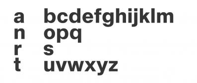
I am a French architect, graphic and type designer interested by written signs in public space, from institutional wayfinding typography to illegal handwriting practices. As a designer and co-founder of TypoMorpho studio, I am mainly working on environmental graphics, wayfinding, signage, exhibition design and architectural lettering. I am also teaching typography and letter design in the Graphic Design Department of the institut supérieur des arts et du design de Toulouse / isdaT, where I recently lead a research program on “single-line” fonts for fablabs’ environments.
Since the mid-2000s, at the crossroads of architecture, typography and urban photography, I have been documenting through photographic books graffiti phenomena like the “Pixação” movement in São Paulo, Brazil, or “Cholo Writing” in Los Angeles, in order to reveal the unexpected but significant evolutions of the Latin alphabet’ shapes worldwide in relation with urban landscapes. Then in the early 2010s I realized a photo and video survey about the “Dishu” water-based ephemeral calligraphic practices in Chinese streets and parks with a focus on handmade writing instruments.
I am currently working on a name-writing in public space handstyles panorama based on six main case studies: Los Angeles (Cholo Writing), New York (Tags & Throw-ups), Philadelphia (Tall Hands & Wickeds), São Paulo, Brazil (Pixação), Tijuana (Trepes) and Monterrey (Ganchos) in Mexico. This comparative approach challenges the architectural concept of “Genius Loci” defined by Christian Norberg-Schulz in the late 1970s (the identity of a place) applied to the globalized Latin alphabet’ usages: nowadays, the possibility of identification seems indeed to reside much more in the graphic atmosphere than in the repetitive architecture and infrastructures of contemporary metropolis.
François Chastanet is an architect, graphic and type designer and documentary author co-founder of TypoMorpho studio, Bordeaux, France. Through graphic design commissions, documentaries and teaching, he explores the relations between architecture and written signs, from wayfinding typography to ephemeral handwritings. He is currently conducting doctoral research at the École pratique des hautes études / Ephe in cotutelle with the Atelier national de recherche typographique / Anrt on the evolution of Latin letterforms through six case studies of graffiti of names’ handstyles in North and South America (Los Angeles, New York and Philadelphia in the United States, São Paulo in Brazil, Tijuana and Monterrey in Mexico).
Name writing in public space is the dominant practice of graffiti since the end of the 20th century. This popular practice most likely represents the only calligraphic school with any weight in the Western cultural reality, where, in the opening 21st century, we currently live in a keyboard civilization. Talking about these illegal inscriptions at an aesthetic level is always complex; it is then important to dispassionately analyzing it. My own approach proposes to study tagging from a formal perspective, as geographically rooted calligraphic schools it actually is: replacing the art of urban signature in the larger history of (Latin) letterforms and identifying metropolitan-based specific handstyles. We have to recognize that different traditions of stylized writing with their own tools, styles and methodologies are coexisting: graffiti as contextual design challenging local urban infrastructures and cultures.
The New York’s graffiti movement, that started in the mid-1960s and became the epicenter of graffiti visual globalization in its spreading in the early 1990s, is of course very important but is actually hiding a more complex situation. There is a historical dispute between Philadelphia and New York to know which city first started this “all-city” graffiti of names game in the late 1960s. To my point of view, documenting how these handstyles stabilized overtime as clearly distinct styles is more important than strict chronological issues. The New York phenomenon became massive in the 1970s and 1980s and beneficiated of a high media coverage, creating the global archetypes that would predominantly define the urban signature until this day.
My residency research focused on Philadelphia that is to the contrary a highly autarkic and unique scene that deserves much greater recognition, an impressive, localized instance of an urban signature “school” within the inner limits of the city’s metropolitan area, a handcrafted visual identity that has remained stable over the years despite some evolutions.
For the Villa Albertine, through direct immersion and exploration, I deepened the Philadelphia case study in an American graffiti cartography: creation of a photo and video corpus on these exceptional urban signatures in order to highlight this under-represented phenomenon. Philly handstyles were initially called “Gangster Prints” in the 1960s and later developed into numerous variants. I investigated the inner Philadelphia development in letter shapes, notably what is called in the local graff milieu the condensed and cursive “Tall Hands” and the extraordinary “Wickeds” (very elaborated wildstyle signatures that developed since the 1980s) with their associated punchlines in clean legible uppercases. These different practices are relatively unknown and represent underrated jewels in street penmanship.
The Philadelphia tagging scene constitutes a genuine example of the emergence of metropolitan collective identities based on letterforms: some cities are able to produce their own scriptural “texture” beyond the individual experiments on the image of the name. The Philadelphia “hands” deserves an in depth photographic and calligraphic study in order to pursue the work engaged by few independent researchers, designers and artists (notably Stephen Powers, Robert Moran, Christian Acker). As the anthropologist Susan Phillips proposes in “The City Beneath: A Century of Los Angeles Graffiti” (Yale University Press, 2021), we should read urban infrastructures and city spaces as texts or archives.
Beyond photographing signatures in interaction with the Philadelphian urban landscape, I parallelly conducted interviews with local “writers” and hand sessions on paper video recorded from the scribe’s viewpoint for an optimal gestural rendering. The complementary use of various drawing observations (architectural diagrams, calligraphic gestural details, lettering models) permits to didactically show the human body as a writing tool and to bring further understanding about the local raw aesthetics of skeletal letterforms in public space.
In partnership with
Atelier National de Recherche Typographique (ANRT)
The Atelier National de Recherche Typographique (ANRT) was created in 1985 by the French Ministry of Culture and the Ministry of Economy and Finance, with the aim to “contribute to the development of type design and typography”. It is now an established research unit within the ENSAD Nancy, in the campus ARTEM. The course develops a singular approach to typographic research, with a strong emphasis on connecting theoretical and practical work, as well as on developing long-term collaborations with world leading research laboratories in other areas, such as linguistics, epigraphy or computer sciences.